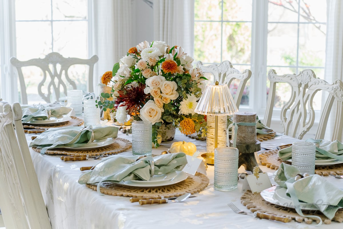
Set an elegant, soft Thanksgiving table this year with a palette of sage, blush, taupe, and subtle metallic accents. I’ll show you how I layered the colors, linens, dinnerware, and seasonal details to create a relaxed setting you can adapt for your own Thanksgiving gathering.
Sage and Blush Thanksgiving Table: Deciding on a Color Scheme
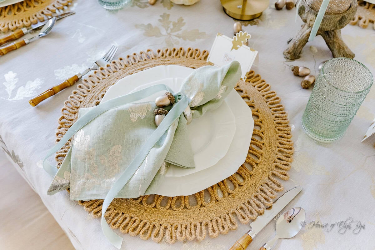
I built this entire Thanksgiving table around napkins that I loved so much. The sage-colored napkins feature block-printed metallic oak leaves, and I found a taupe tablecloth printed with the same leaf design. Together, they gave me an elegant starting point for a Thanksgiving table with softer colors and a little shimmer.
The sage-and-taupe combination felt peaceful and understated, but I wanted to add a few warmer touches to keep the table from feeling too neutral. Blush roses and rust-colored flowers brought in just enough autumn color without taking the setting in the usual orange-and-brown direction.

A Fresh Take on the Thanksgiving Table
If you enjoy traditional Thanksgiving gatherings but would like a change from the familiar orange, brown, and burgundy decorations, consider a softer color palette. Last year, I took that approach with my Thanksgiving table, and the result was a relaxed setting with an understated look.
I usually set my Thanksgiving table ahead of the holiday so I can photograph it and have time to work through the details. That means the table often appears on the blog the following year, but I get to enjoy the same arrangement when Thanksgiving arrives. I also get to hear what guests think and notice which details make the biggest impression.
For this table, the response was especially encouraging. Guests commented on how peaceful and welcoming the colors felt. If you are ready to try something different this Thanksgiving, here are the details that brought this softer look together.
Sage and Blush Thanksgiving Table: Choosing a Calming Color Palette
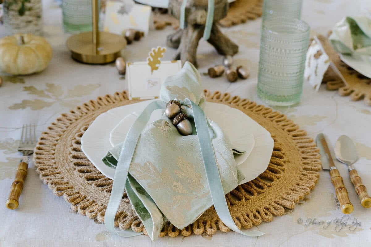
I found the sage napkins that inspired this table a couple of years ago. I loved the fabric’s soft, fluid feel and the shimmering silver-gold oak leaves stamped across it. When I paired them with the coordinating gray-taupe tablecloth, the two patterns created a subtle foundation without competing for attention.
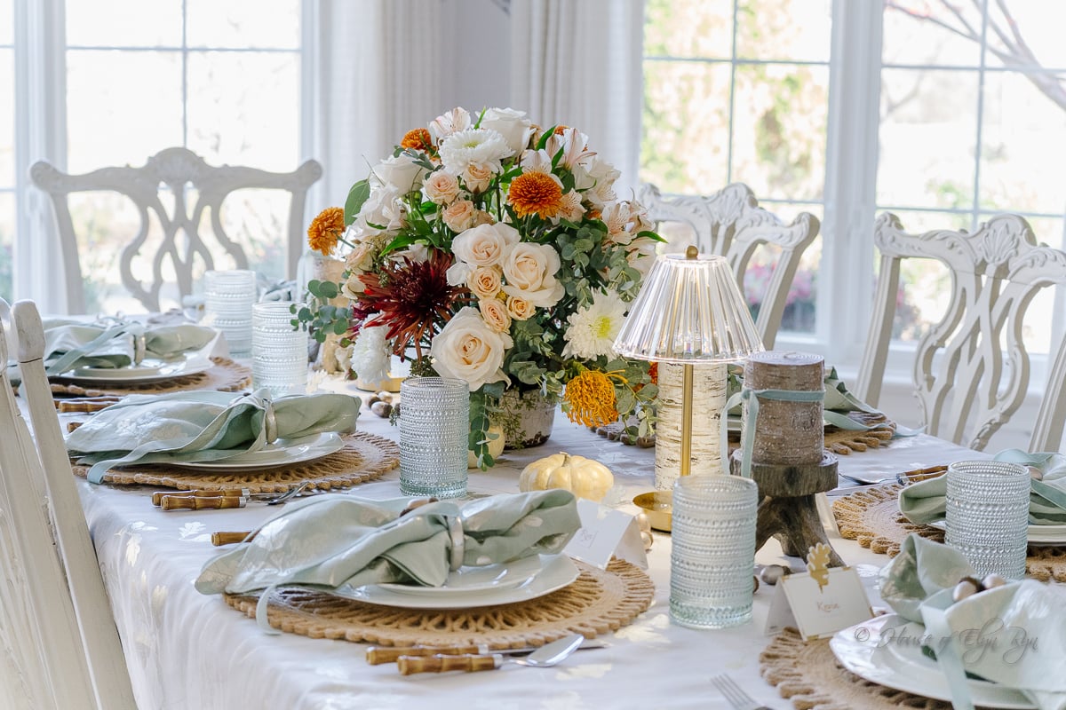
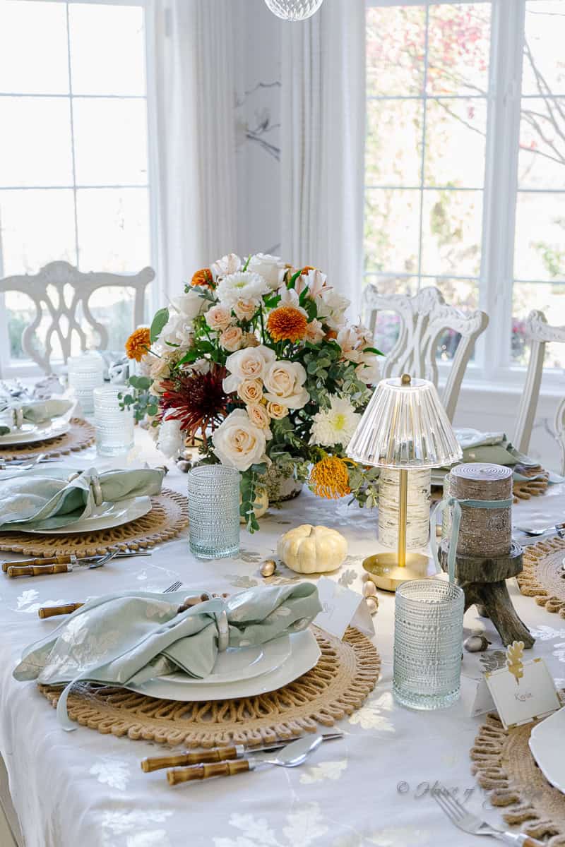
With the linens in place, I kept the other pieces relatively neutral. White dinnerware and white pumpkins continued the light, understated look, while the flowers introduced blush, rust, and a little yellow-orange. This balance kept sage as the dominant color while adding enough fall warmth.
When choosing colors for your own table, start with one piece you love, such as a set of napkins, patterned dinnerware, a tablecloth, or even a floral arrangement. Use that piece to guide the rest of your choices. A few coordinating colors usually create a more cohesive look than introducing too many seasonal shades.
Layering for Depth and Interest
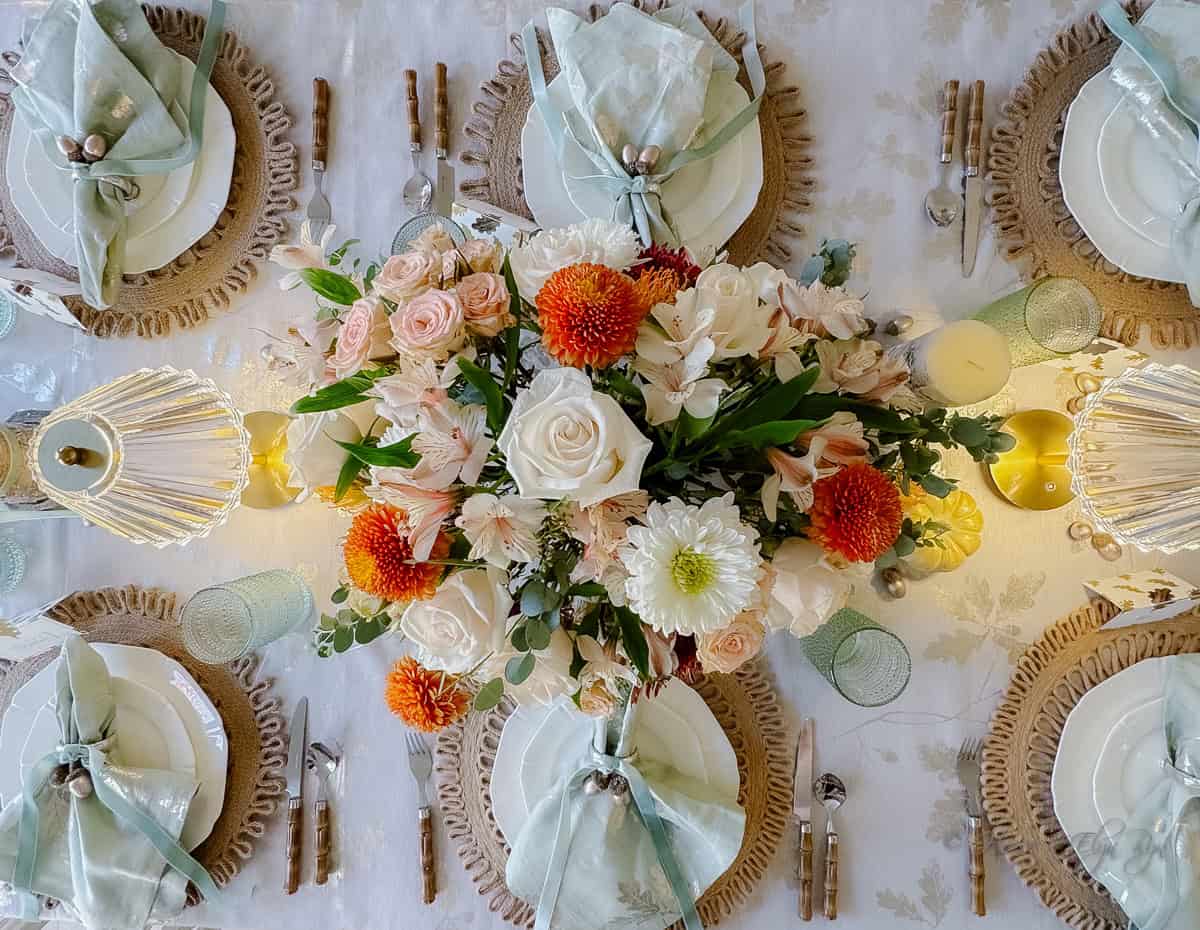
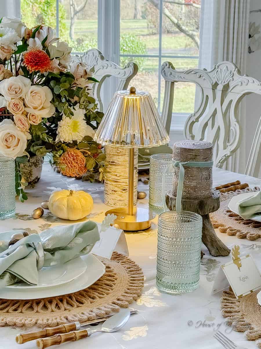
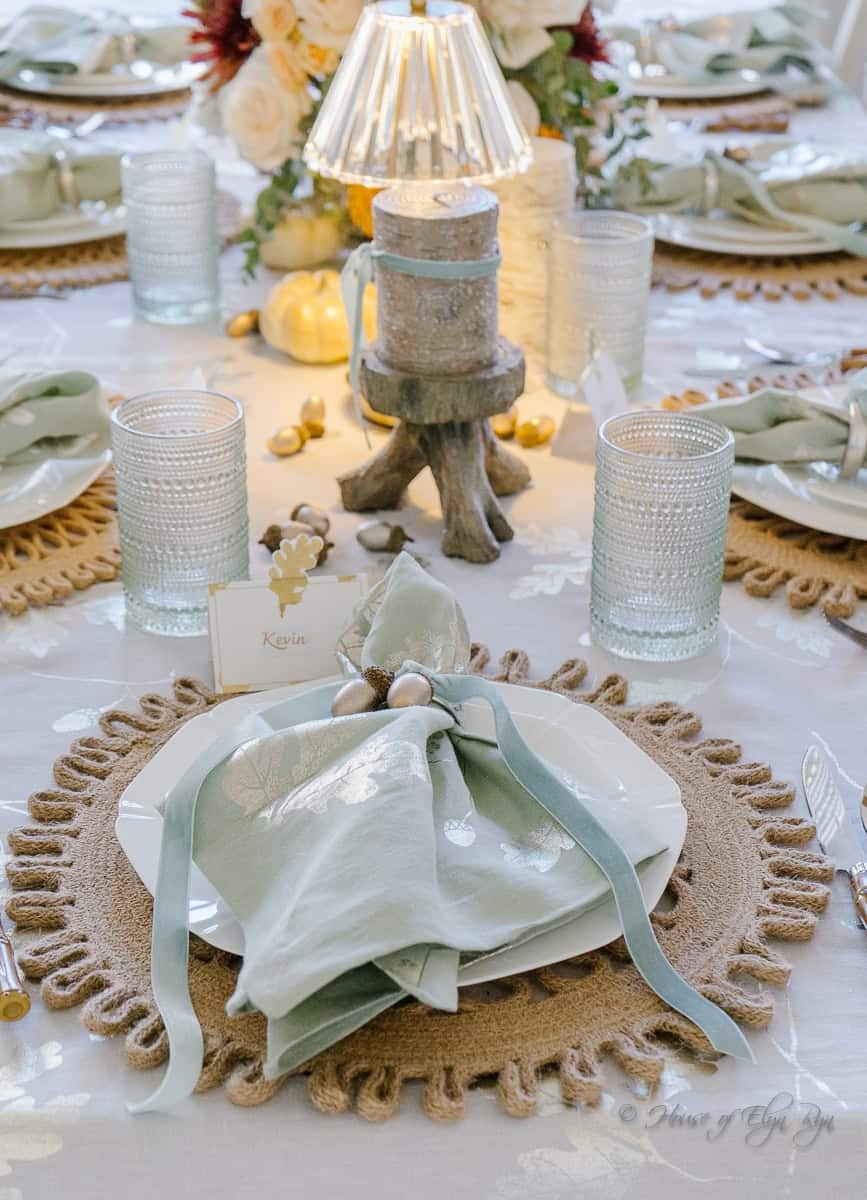
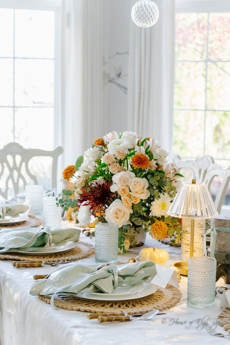
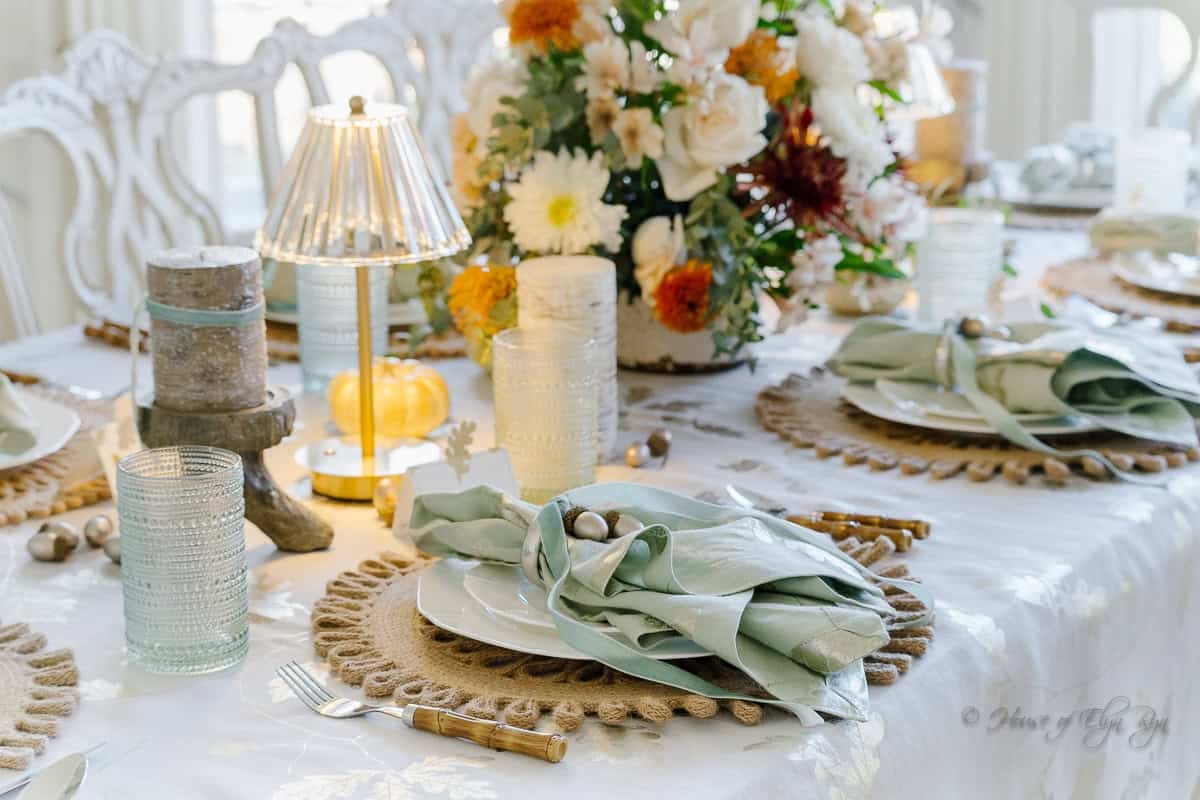
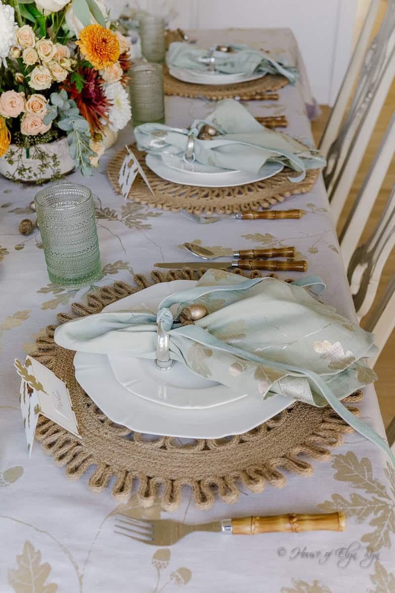
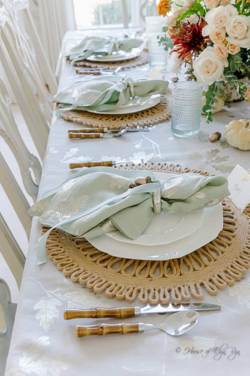
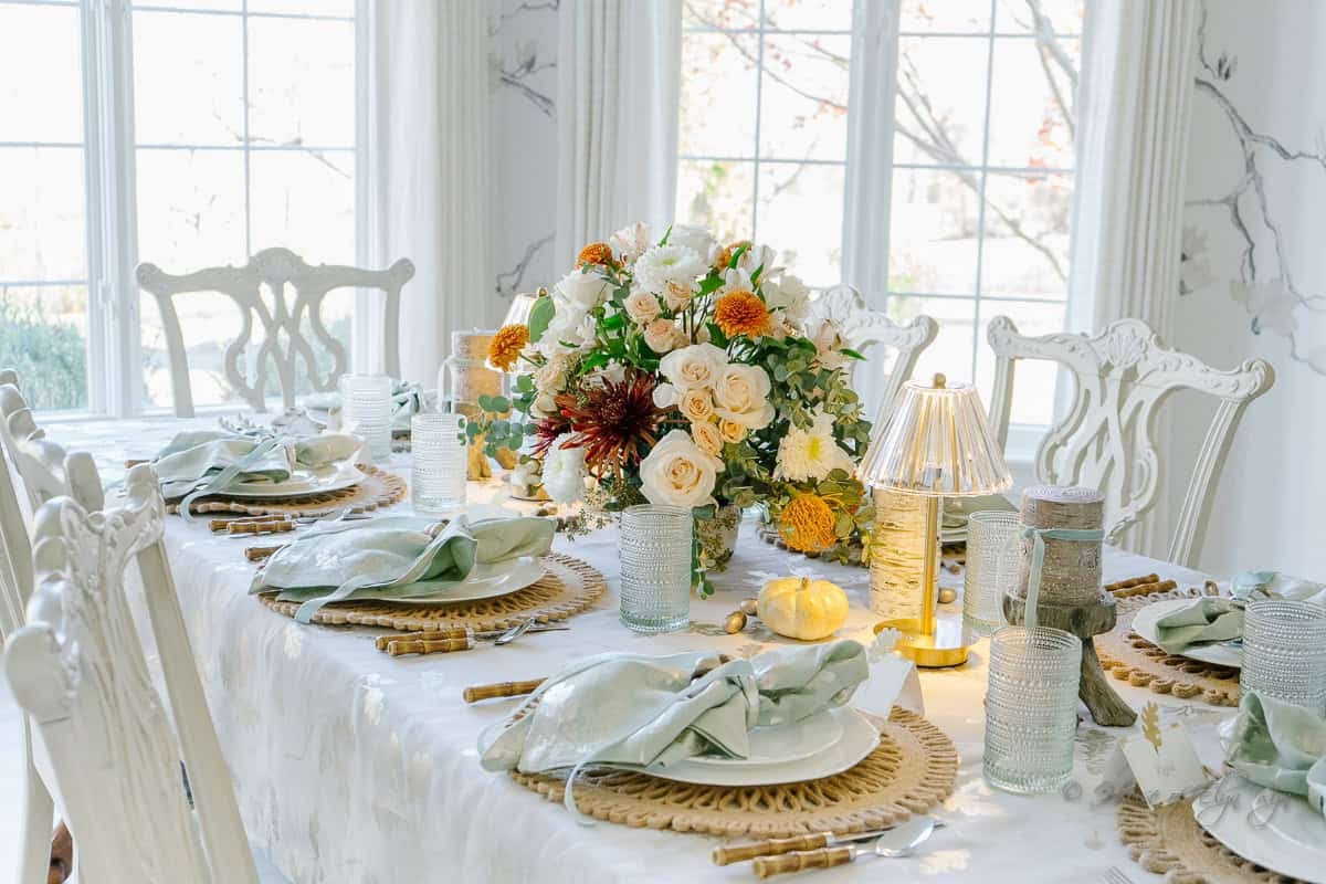
Layers add dimension to a tablescape and make each place setting feel more considered. I began with light brown woven placemats, which added warmth and texture against the smooth gray-taupe tablecloth. Crisp white dinnerware kept the place settings fresh and bright, while bamboo silverware introduced another natural element.
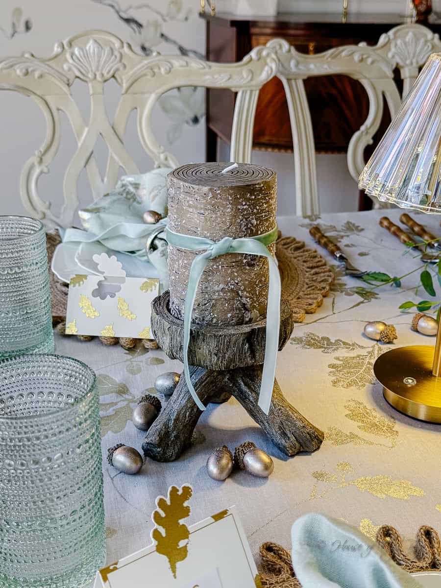
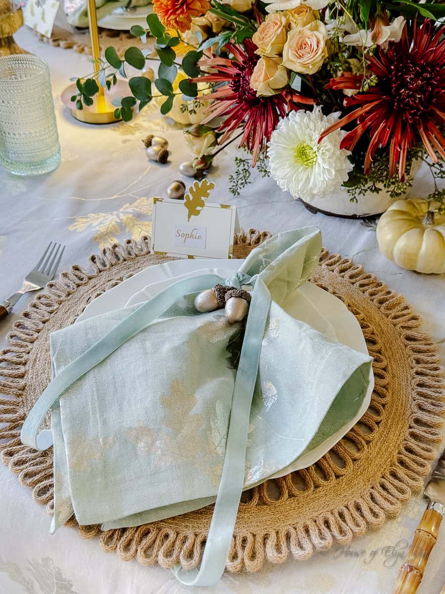
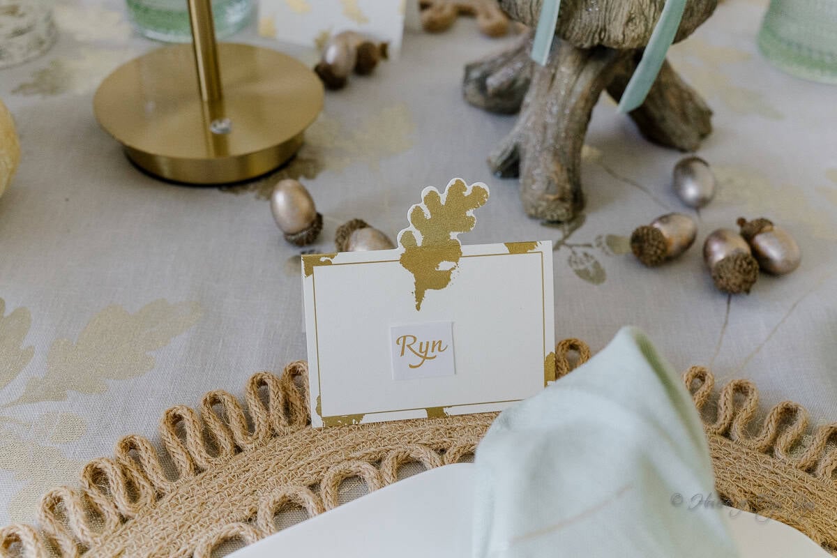
For the napkins, I used silver napkin rings and tied each one with a sage velvet ribbon. The ribbon added a soft, cozy texture and repeated the color of the napkins and glassware. I also scattered gold acorns across the table for a small seasonal accent.
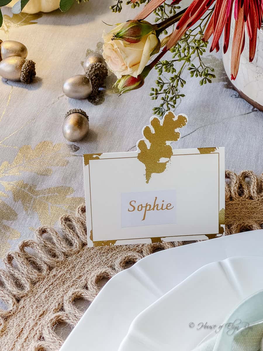
The acorns were a little too bright in their original finish, so I brushed them with a coat of champagne-gold metallic acrylic paint. The softer finish tied them in with the metallic leaves on the linens without adding too much shine.
A good way to create this same layered effect is to mix finishes and textures rather than relying on color alone. Woven placemats, smooth dinnerware, velvet ribbon, and metallic accents each add something different while still working together.
Accentuating with Unique Tabletop Details
To carry the sage color beyond the napkins, I used sage-colored glassware. Repeating a color in more than one place helps a tablescape feel intentional, especially when the rest of the palette is made up of neutrals.
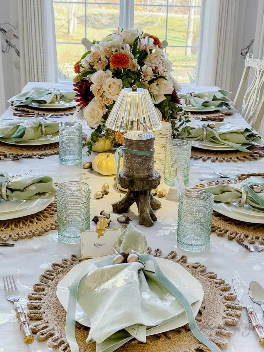
I scattered white pumpkins down the center of the table. They added a recognizable fall detail while keeping the arrangement light and understated. Birchwood-look pillar candles on woodland-inspired stands added height and a natural texture that complemented the pumpkins.
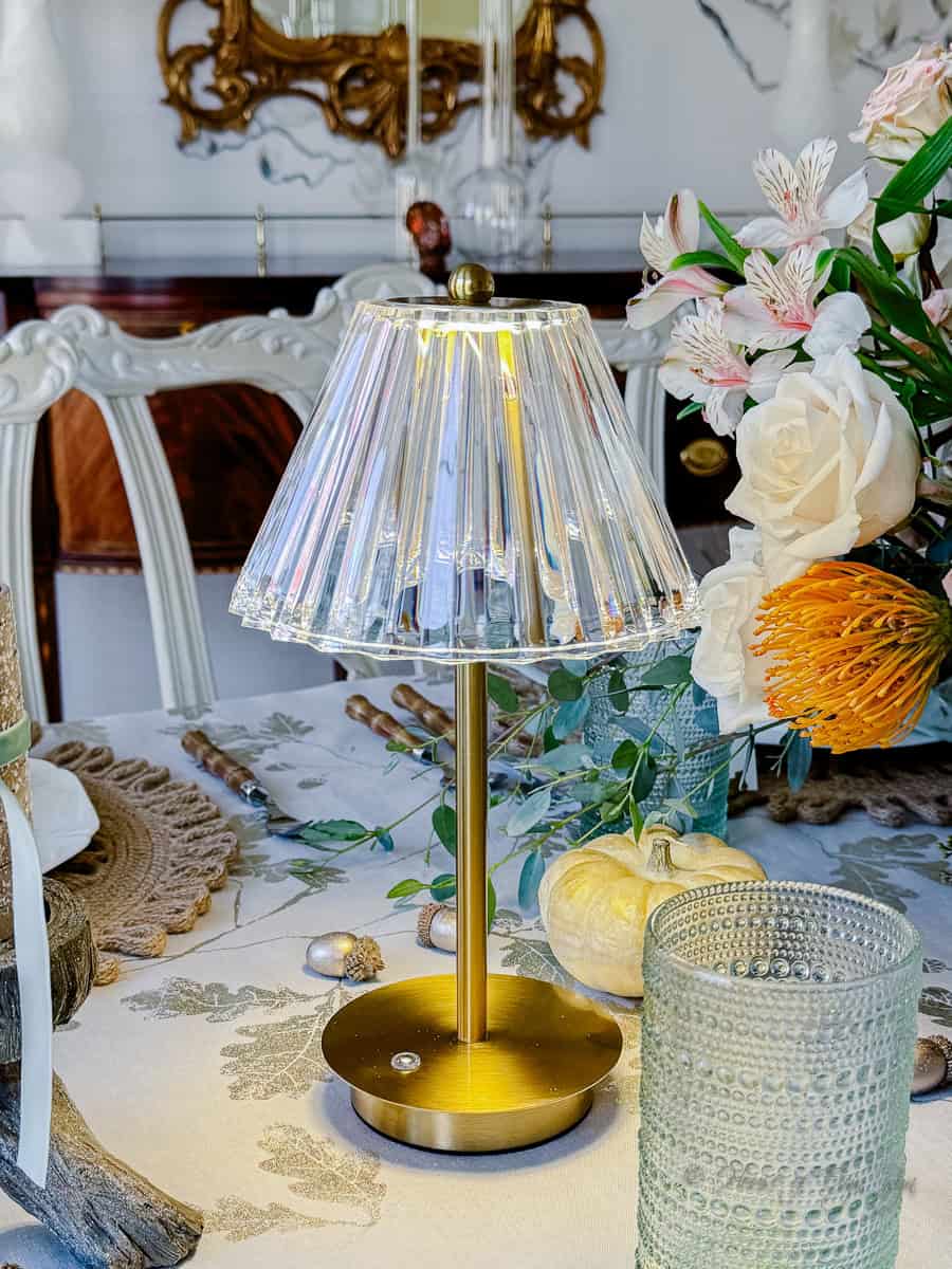
I also added two gold, cordless table lamps with clear shades. Their warm light gave the table an inviting glow and added another layer of interest. Table lamps are a nice alternative to relying entirely on overhead lighting or candlelight, particularly when you want a soft atmosphere for an evening gathering.
A Showstopping Centerpiece
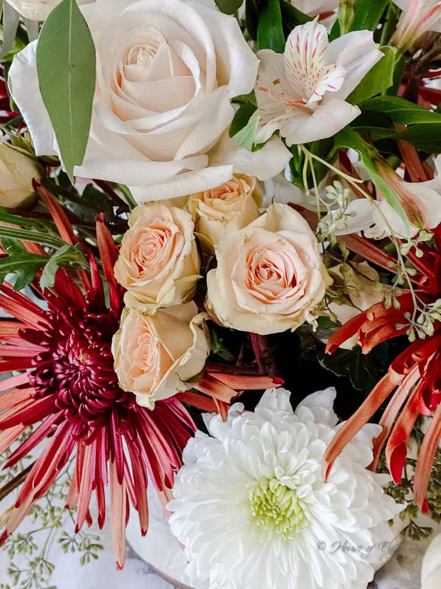
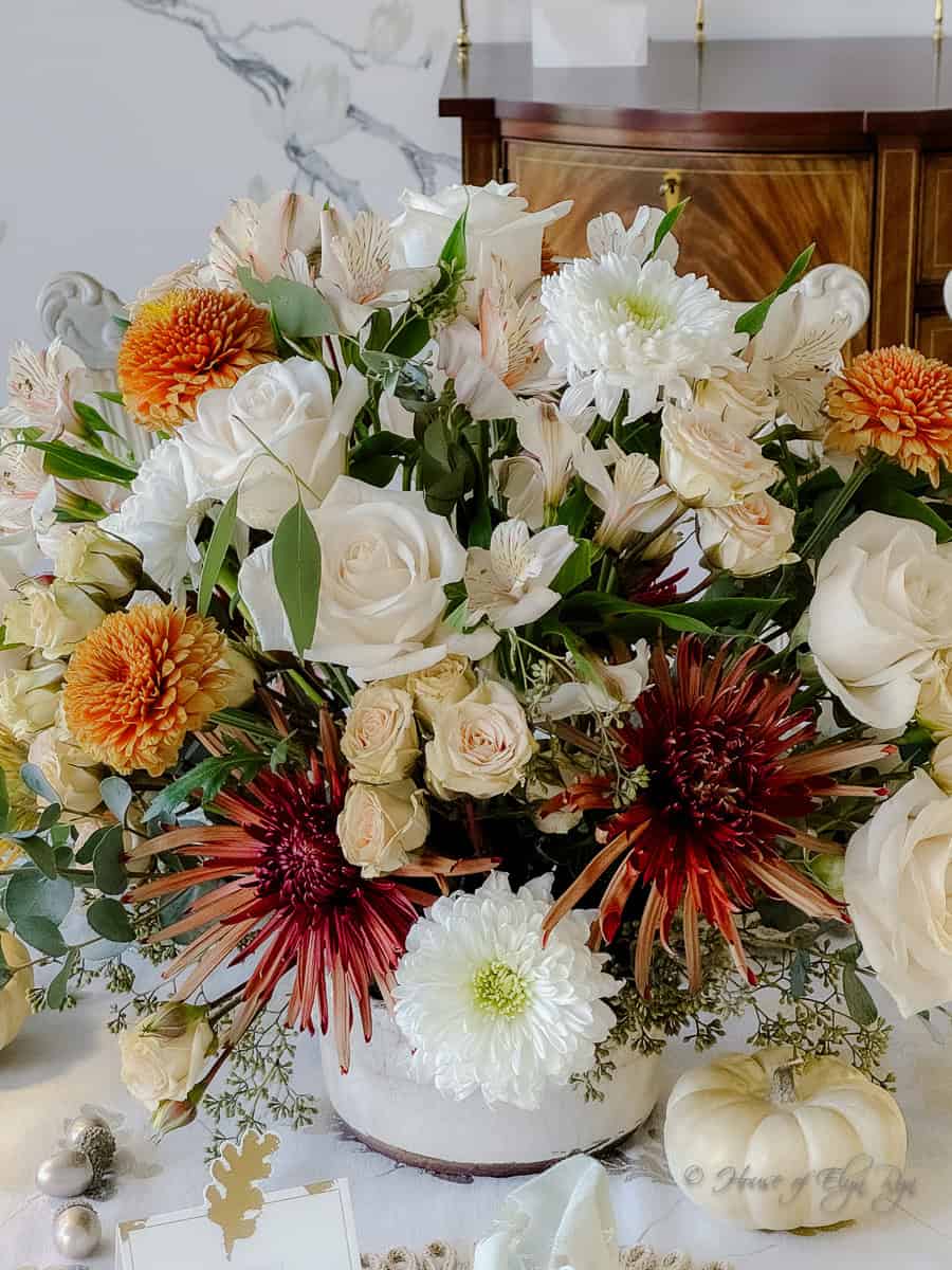
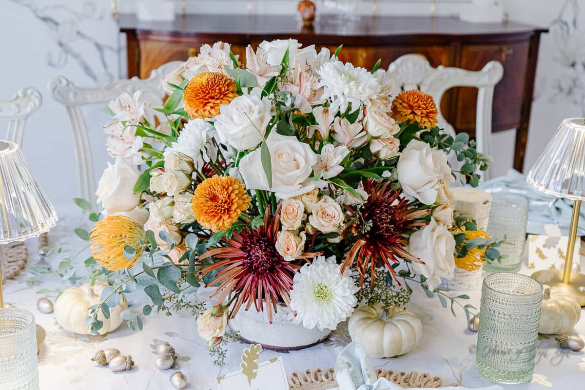
For the centerpiece, I arranged fresh flowers in an antiqued white vase. The arrangement included white and blush roses, white and rust alstroemeria, rust mums, and yellow-orange protea blooms.
The flowers brought together the colors used throughout the table. Blush roses softened the arrangement, while the rust mums and warmer protea blooms gave it a distinctly autumn feel. The white flowers helped keep the overall look light and connected the centerpiece to the dinnerware and pumpkins.
I like using flowers to introduce colors that might otherwise feel too strong in the linens or place settings. Here, the rust and yellow-orange blooms added warmth without changing the table’s peaceful character. A mix of soft and deeper colors is an easy way to bring a neutral tablescape into the fall season.
Why a Softer Thanksgiving Table Works
One of the nicest things about this table was how guests responded to it. Several commented on the peaceful colors and how welcoming the setting felt. The palette was different from the more energetic colors often associated with Thanksgiving, but it still had plenty of seasonal character.
A softer Thanksgiving table doesn’t mean giving up fall color. Start with a neutral foundation, add a color you love, and bring in warmer seasonal shades through flowers, pumpkins, or small decorative accents. Sage and taupe provided a calm foundation for this table, while blush and rust added the warmth it needed.
The result was a setting that felt special without being overly formal. Most importantly, it was a table where everyone could settle in, enjoy the meal, and linger a little longer.
Other Tables You Might Like
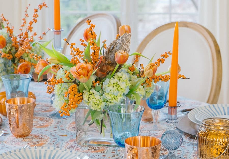
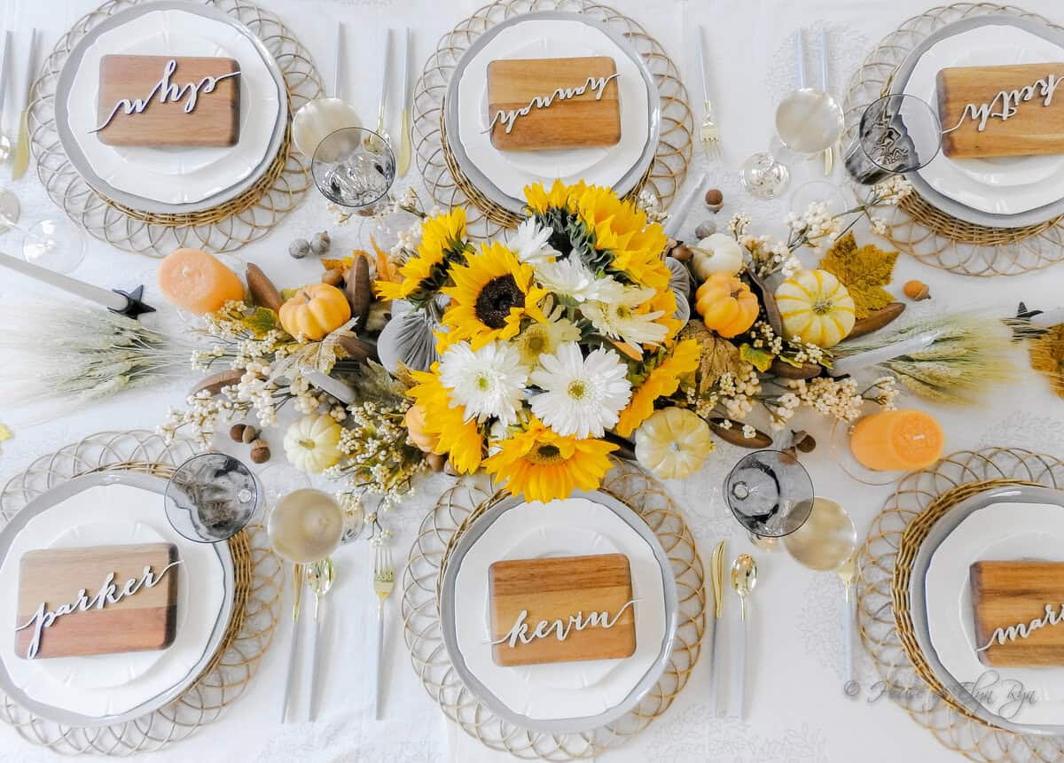
If you enjoy this approach to Thanksgiving decorating, you might also like these other seasonal tables. Each uses a different combination of colors and textures to create its own look.
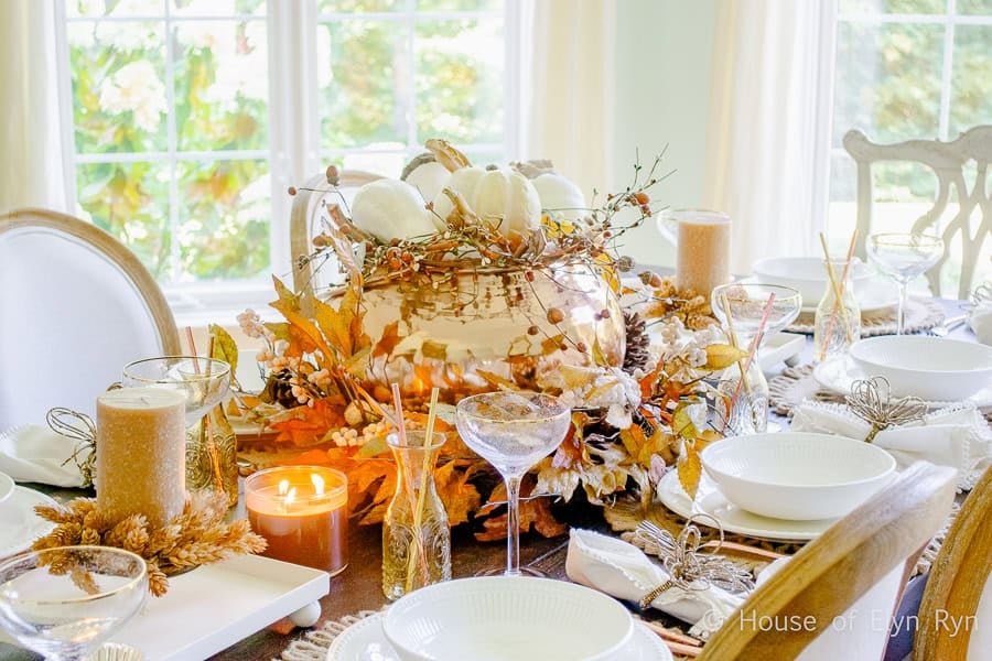
Thanksgiving Recipes to Complement Your Table
A beautiful table is only part of a Thanksgiving gathering. If you are planning your holiday menu, here are a few recipes to serve alongside your favorite dishes.
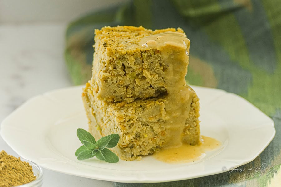
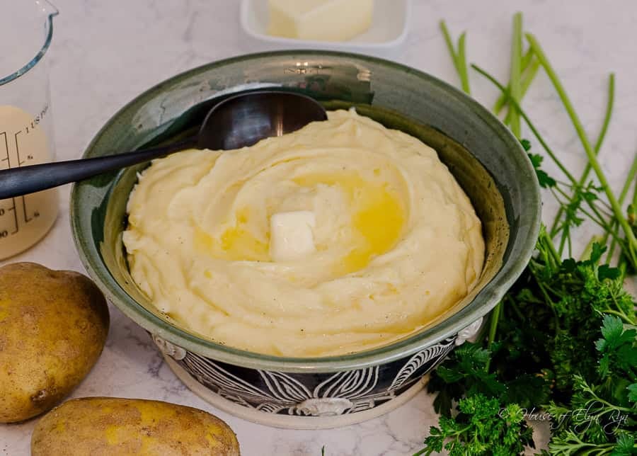

Sage and Blush Thanksgiving Table Gallery
Here are more views of the table, including the place settings, floral arrangement, and smaller details that helped bring the look together.